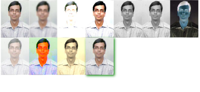
Image Filters In HTML CSS
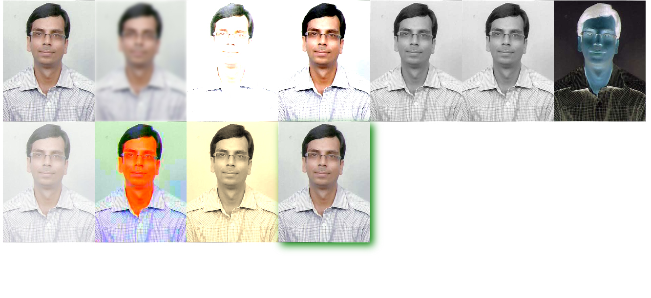
Image Filters In HTML CSS in Delhi
HTML Code
<img src=”sanjay-jain.jpg” alt=”” width=”300″ height=”300″>
<img class=”blur” src=”sanjay-jain.jpg” alt=”” width=”300″ height=”300″>
<img class=”brightness” src=”sanjay-jain.jpg” alt=”” width=”300″ height=”300″>
<img class=”contrast” src=”sanjay-jain.jpg” alt=”” width=”300″ height=”300″>
<img class=”grayscale” src=”sanjay-jain.jpg” alt=”sanjay-jain” width=”300″ height=”300″>
<img class=”grayscale” src=”sanjay-jain.jpg” alt=”sanjay-jain” width=”300″ height=”300″>
<img class=”invert” src=”sanjay-jain.jpg” alt=”sanjay-jain” width=”300″ height=”300″>
<img class=”opacity” src=”sanjay-jain.jpg” alt=”sanjay-jain” width=”300″ height=”300″>
<img class=”saturate” src=”sanjay-jain.jpg” alt=”sanjay-jain” width=”300″ height=”300″>
<img class=”sepia” src=”sanjay-jain.jpg” alt=”sanjay-jain” width=”300″ height=”300″>
<img class=”shadow” src=”sanjay-jain.jpg” alt=”sanjay-jain” width=”300″ height=”300″>
CSS Code
img {
width: 33%;
height: auto;
float: left;
max-width: 235px;
}
.blur {-webkit-filter: blur(4px);filter: blur(4px);}
.brightness {-webkit-filter: brightness(250%);filter: brightness(250%);}
.contrast {-webkit-filter: contrast(180%);filter: contrast(180%);}
.grayscale {-webkit-filter: grayscale(100%);filter: grayscale(100%);}
.huerotate {-webkit-filter: hue-rotate(180deg);filter: hue-rotate(180deg);}
.invert {-webkit-filter: invert(100%);filter: invert(100%);}
.opacity {-webkit-filter: opacity(50%);filter: opacity(50%);}
.saturate {-webkit-filter: saturate(7); filter: saturate(7);}
.sepia {-webkit-filter: sepia(100%);filter: sepia(100%);}
.shadow {-webkit-filter: drop-shadow(8px 8px 10px green);filter: drop-shadow(8px 8px 10px green);}