PURE HTML CSS Image Hover Effect
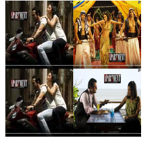
HTML Code
<!doctype html>
<html>
<head>
<meta charset="utf-8">
<title>Untitled Document</title>

</head>

<body>
  <div class="s1">
  <div class="a1"></div>
  <div class="a2"></div>
    <div class="a3"></div>
    <div class="a4"></div>
  </div>
</body>
</html>
CSS Code
<style>
    @keyframes dd{
      from{
        width:100px; height:100px;
        z-index:10;
      }
      to{
        width:200px; height:200px;
        z-index:10;
      }
    }
      @keyframes dd1{
      from{
        width:100px; height:100px;top:0;
      left:100px;
        z-index:10;
      }
      to{
        width:200px; height:200px;
        z-index:10;left:0;top:0;
      }
    }
      @keyframes dd2{
      from{
        width:100px; height:100px;top:100px;
      left:0;
        z-index:10;
      }
      to{
        width:200px; height:200px;left:0;top:0;
        z-index:10;
      }
    }
      @keyframes dd3{
      from{
        width:100px; height:100px;top:100px;

      left:100px;
        z-index:10;
      }
      to{
        width:200px; height:200px;
        z-index:10;left:0;top:0;
      }
    }
    .s1{
      width:200px;
      height:200px;
      position:relative;
    }
    .a1{
      width:100px;
      height:100px;
      position:absolute;
      background-image:url("image1.jpg");
      top:0;
      left:0;
      background-size:100%;
    }
    .a1:hover{
      width:200px;
      height:200px;
      animation:dd 1s;
    }
    .a2:hover{
      width:200px;
      height:200px;
      animation:dd1 1s;
      left:0;
      top:0;
    }
    .a3:hover{
      width:200px;
      height:200px;
      animation:dd2 1s;
      left:0;
      top:0;
    }
    .a4:hover{
      width:200px;
      height:200px;
      animation:dd3 1s;
      left:0;
      top:0;
    }
    .a2{
      width:100px;
      height:100px;
      position:absolute;
      background-image:url("image2.jpg");
      top:0;
      left:100px;
      background-size:100%;
    }
    .a3{
      width:100px;
      height:100px;
      position:absolute;
      background-image:url("image1.jpg");
      top:100px;
      left:0;
      background-size:100%;
    }
    .a4{
      width:100px;
      height:100px;
      position:absolute;
      background-image:url("image4.jpg");
      top:100px;
      background-size:100%;
      left:100px;
    }